

New York Knicks,
branding.
Role: Senior Designer/Developmental Creative Strategy
A brand system created for the Knicks' 2020 Season geared towards attracting Gen Z as well as celebrating the persona of New York. To achieve this we looked at past and present Knicks visual languages, contemporary design trends our target audience consumes, created a variety of assets to torture test against, and then handed off a new set of brand guidelines for our partner.
What you’ll see below is a brief outline of the overall creative process, from audit and strategic development to the creation of a brand book for easy reference.

Creative Audit
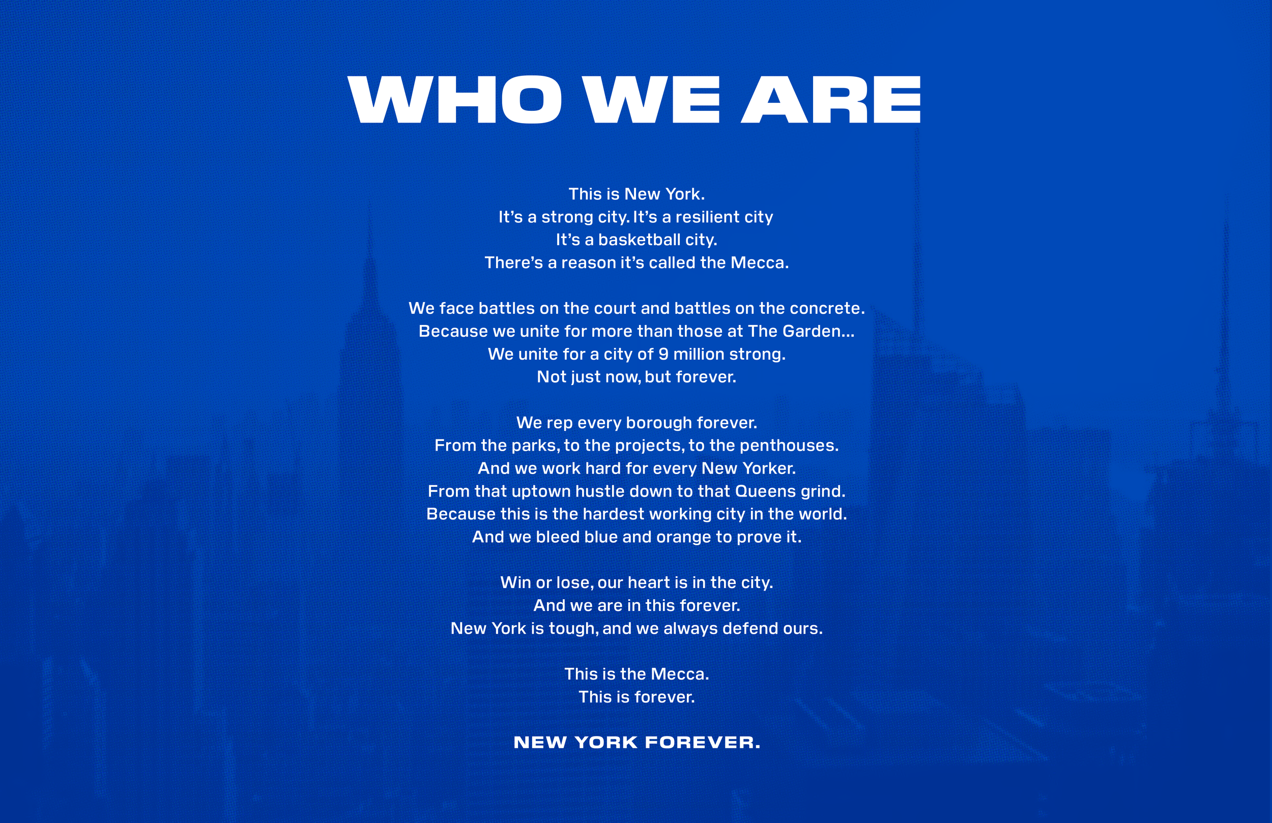
To kick off the assignment we started with an in-depth audit on the Knicks and our target demo. Over the course of several weeks we looked into Knicks history and dissected any component of their brand identity and visual language (past and present), current presence on film, social, and digital, how they visualize apparel, in-stadium graphics, and how they presented themselves in the community. From this stage we dissected the breath of languages and articulated avenues to consider for our rebrand.
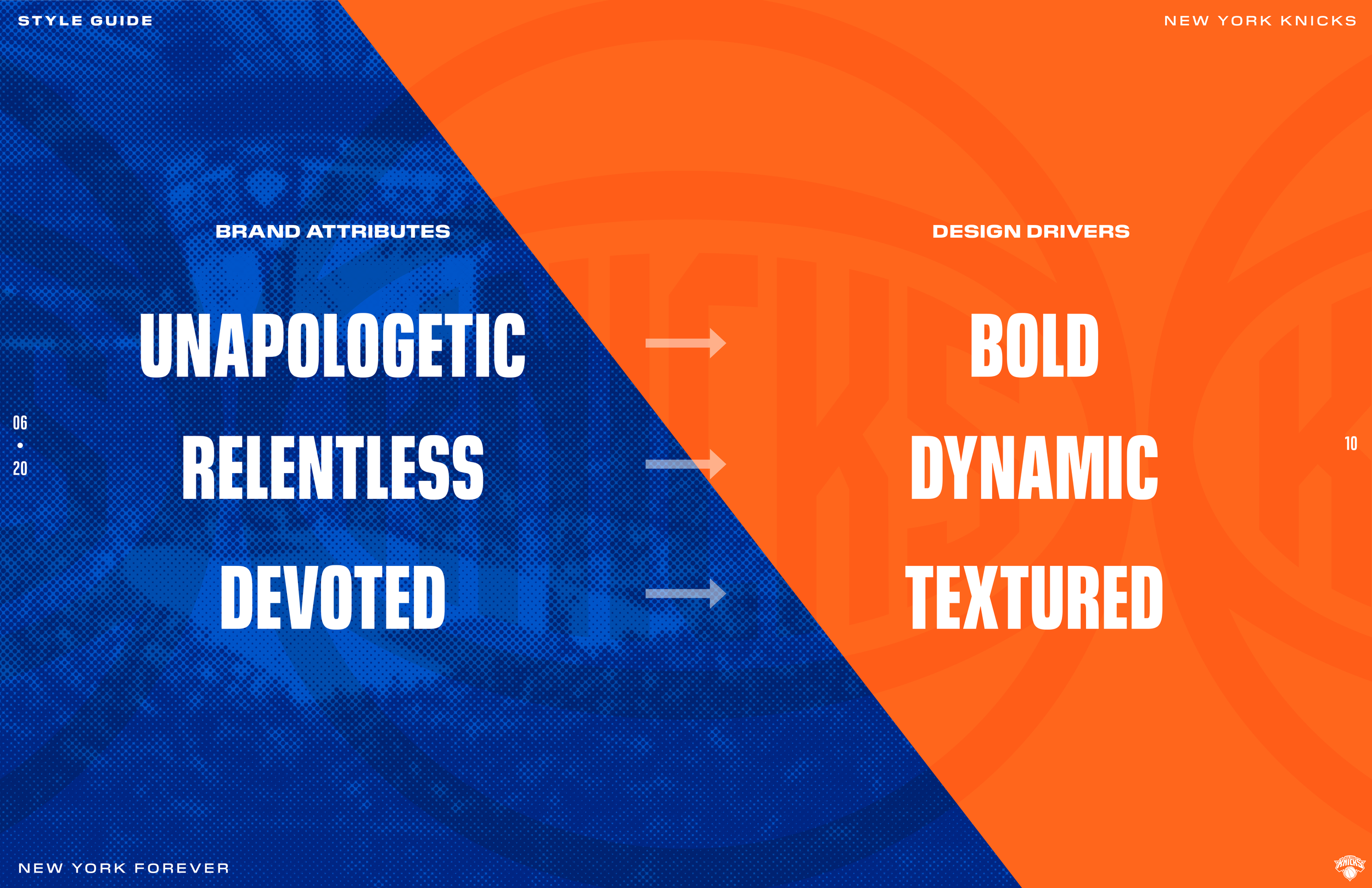
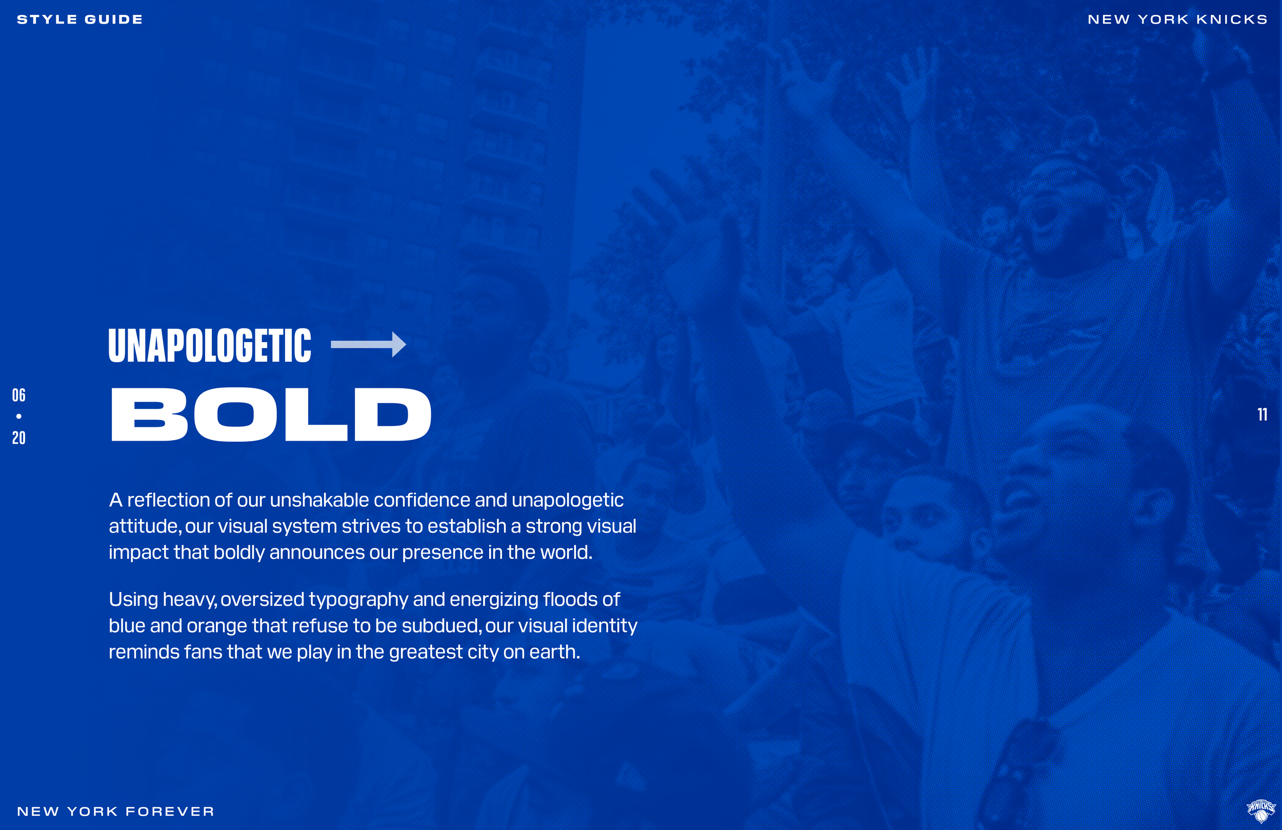
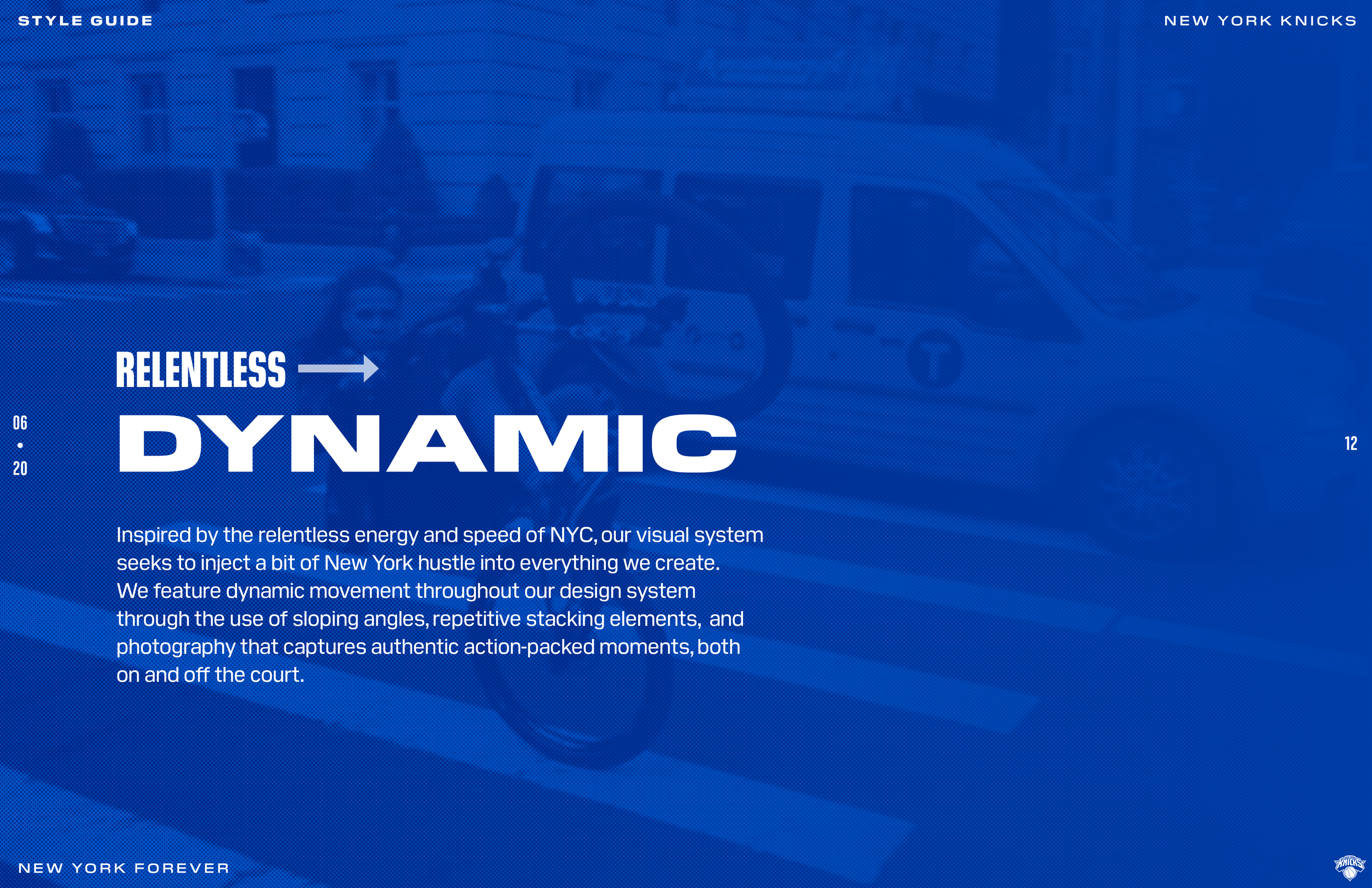
After articulating a point of view we also looked towards our key market; Gen Z. To understand their visual language we audited popular music artists, commercial brands, and experiential activations. From this research; reoccurring themes came to surface and we presented a new language based on key attributes that informed our design drivers.
Asset Creation
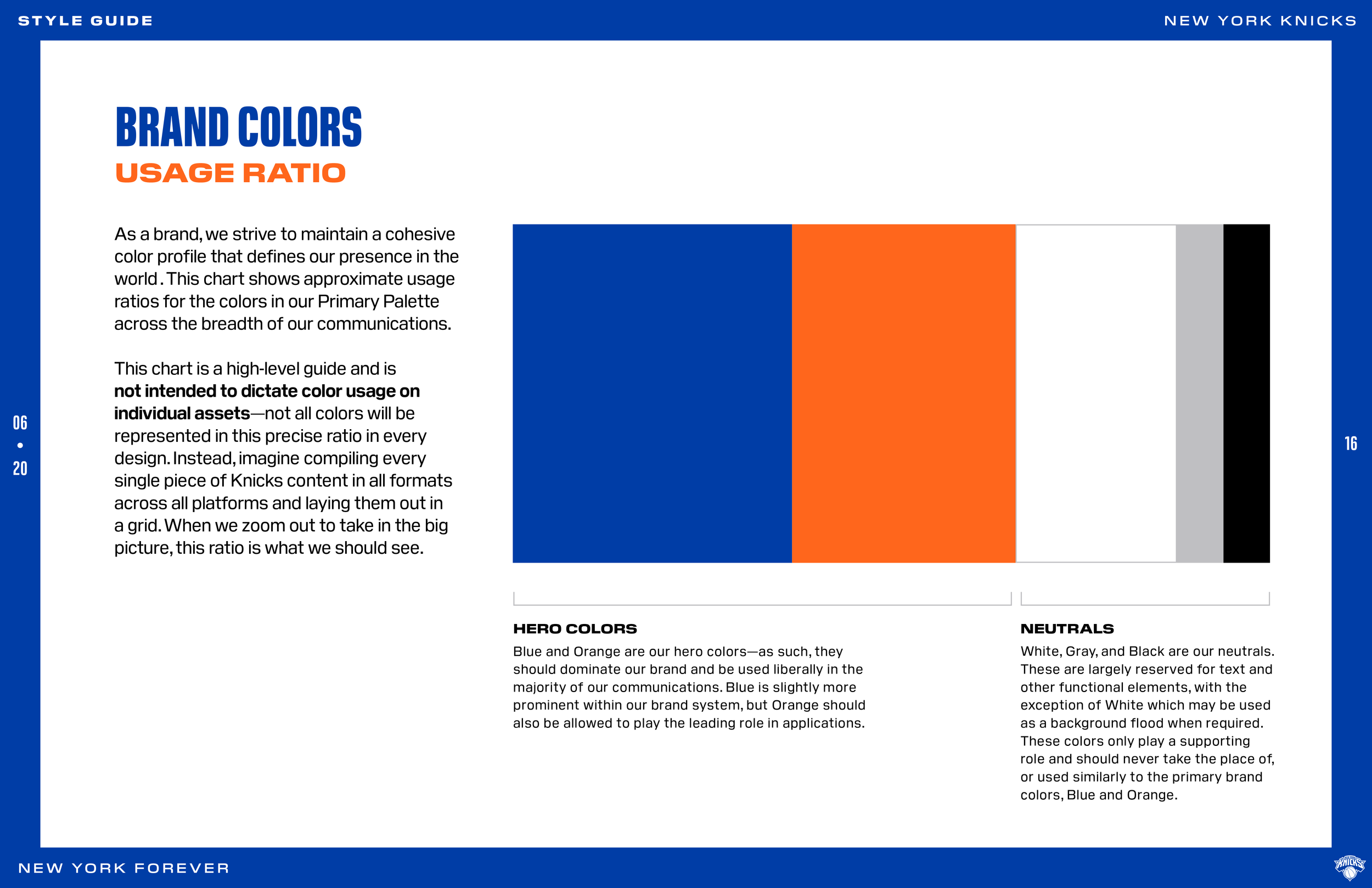
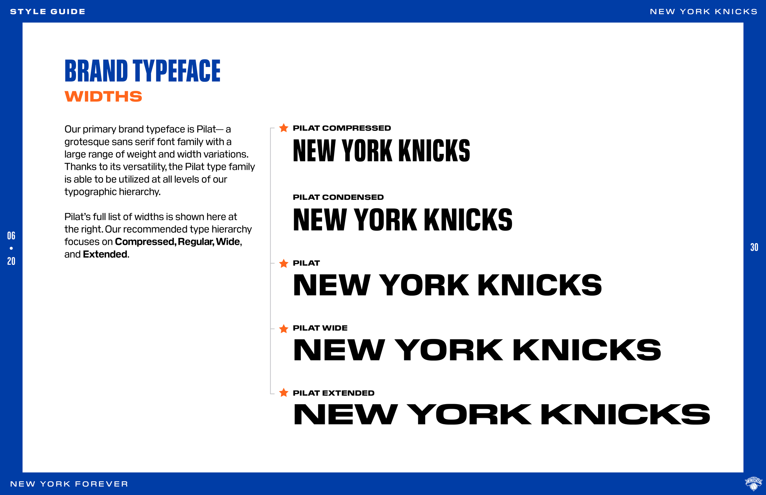
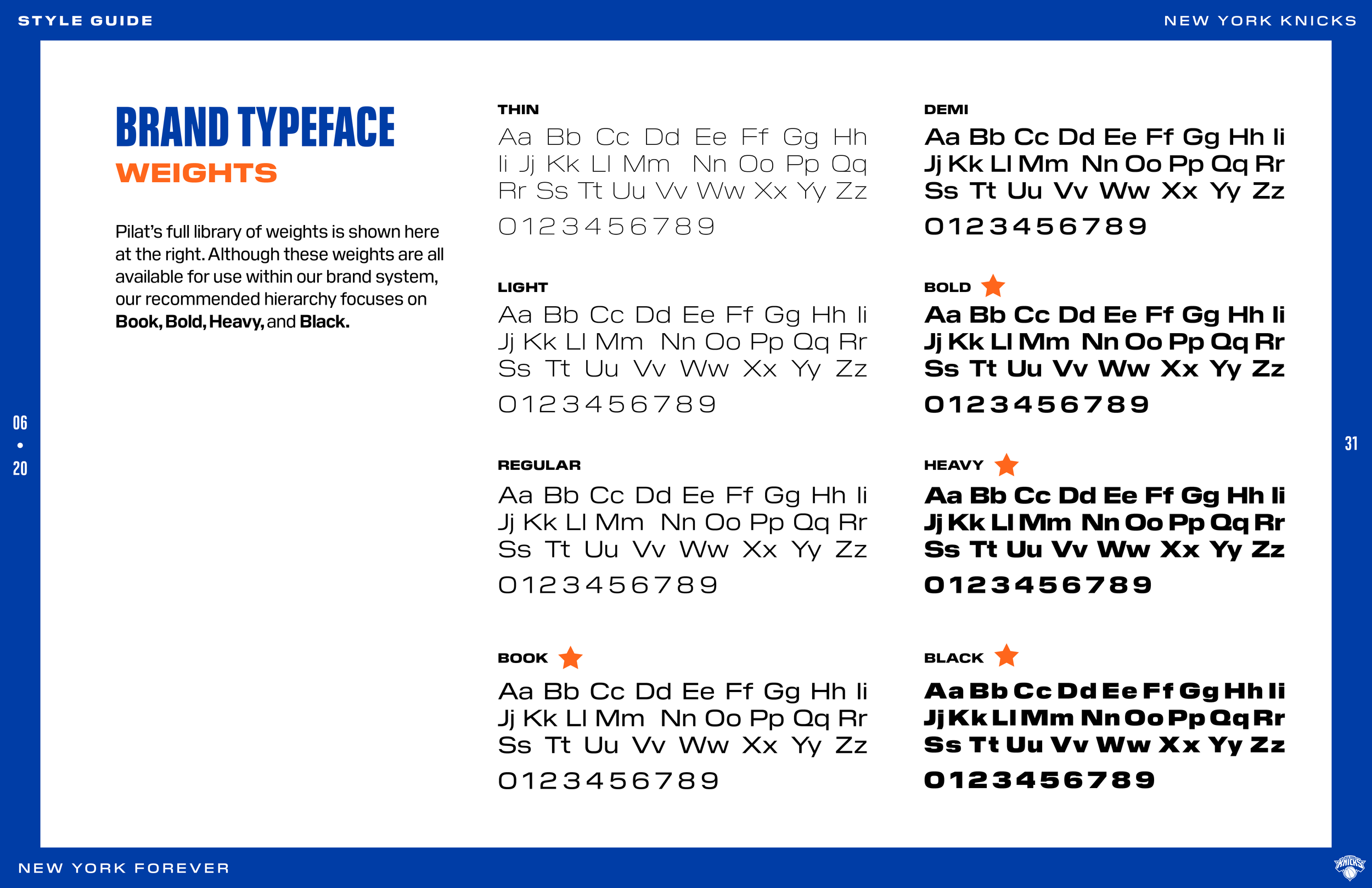
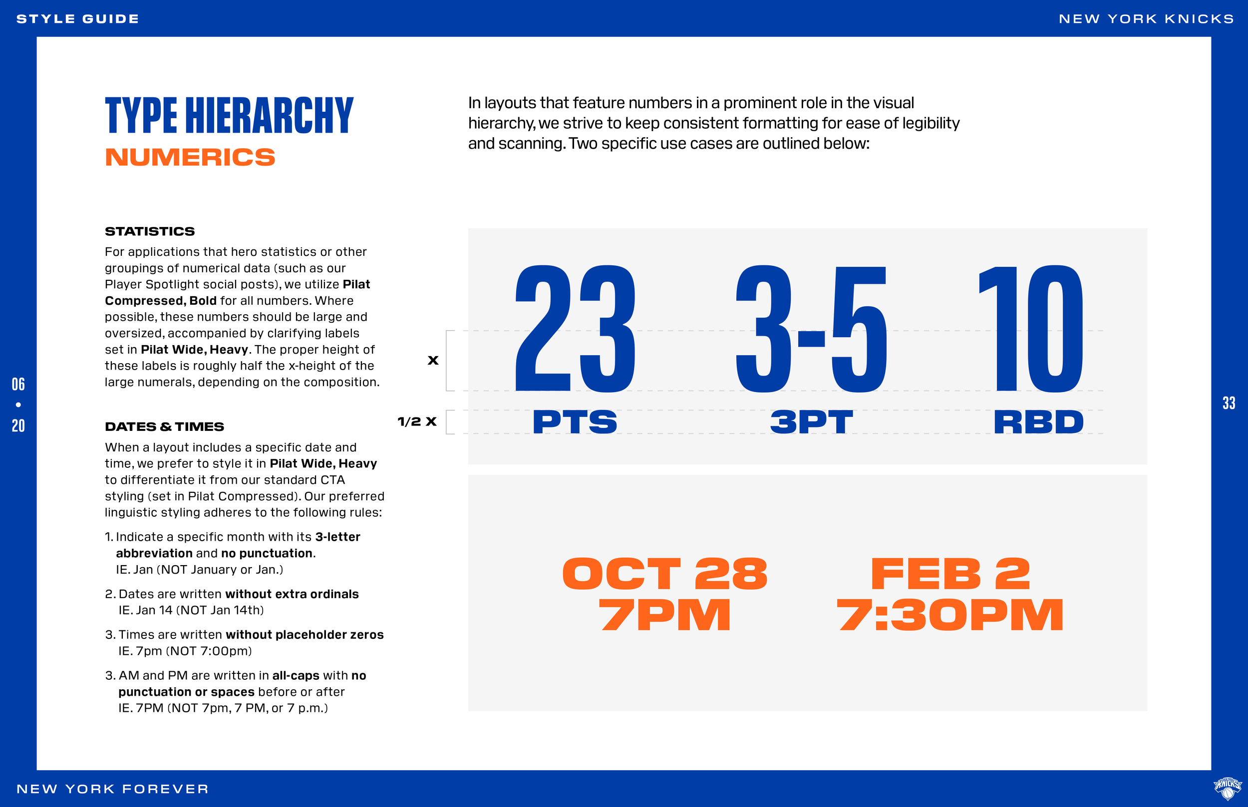
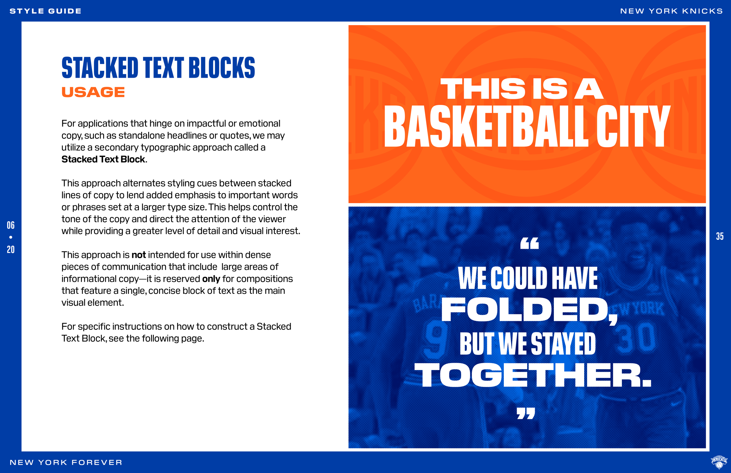
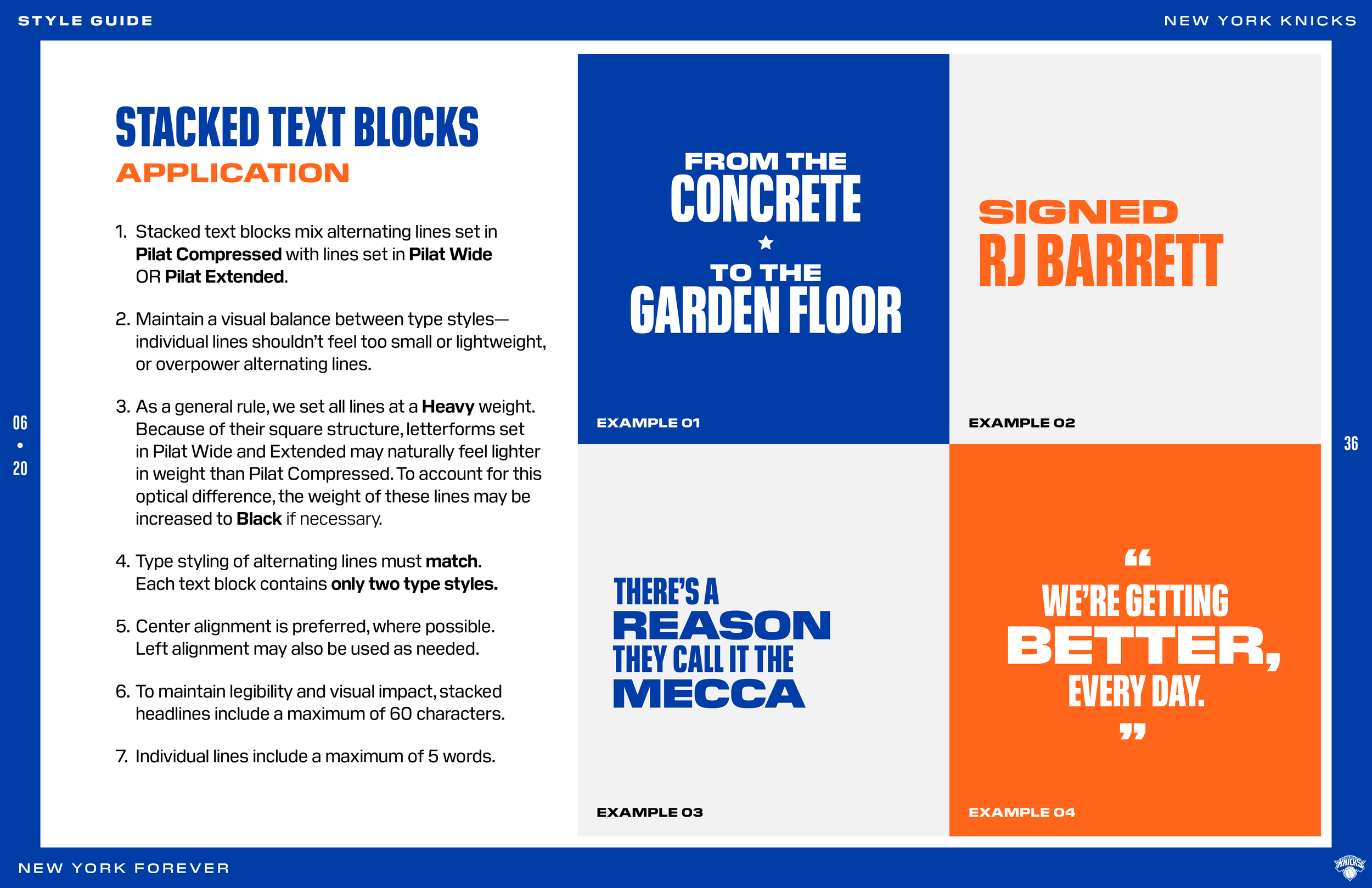
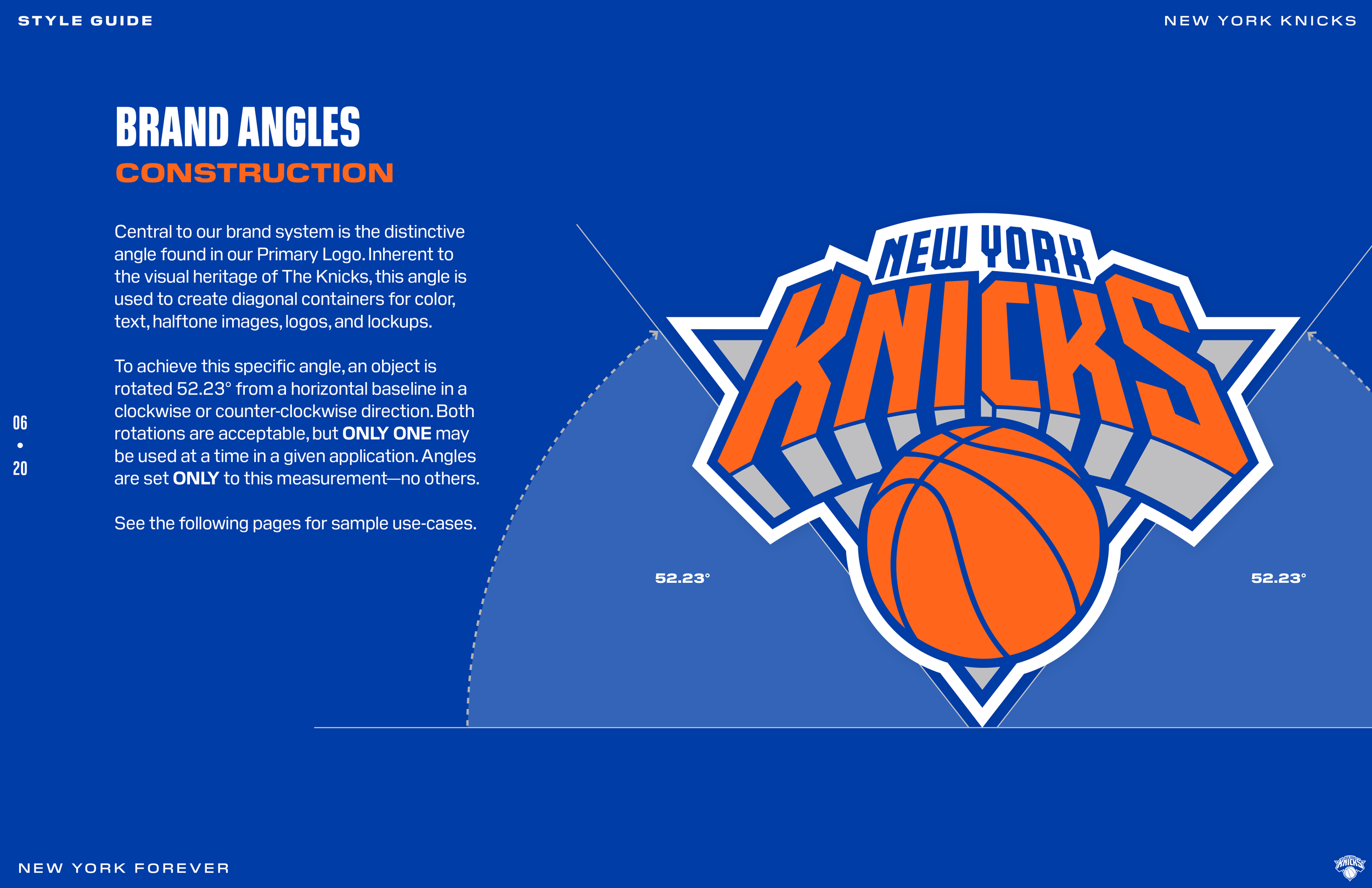
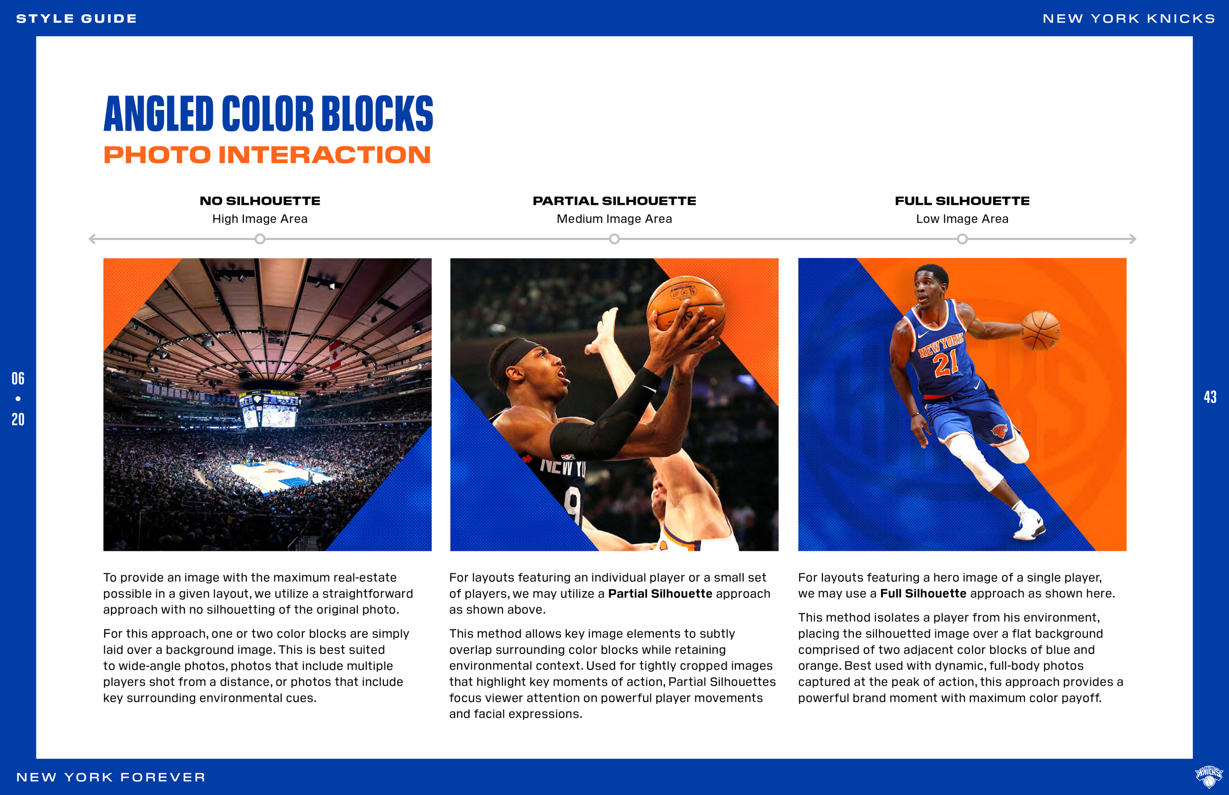
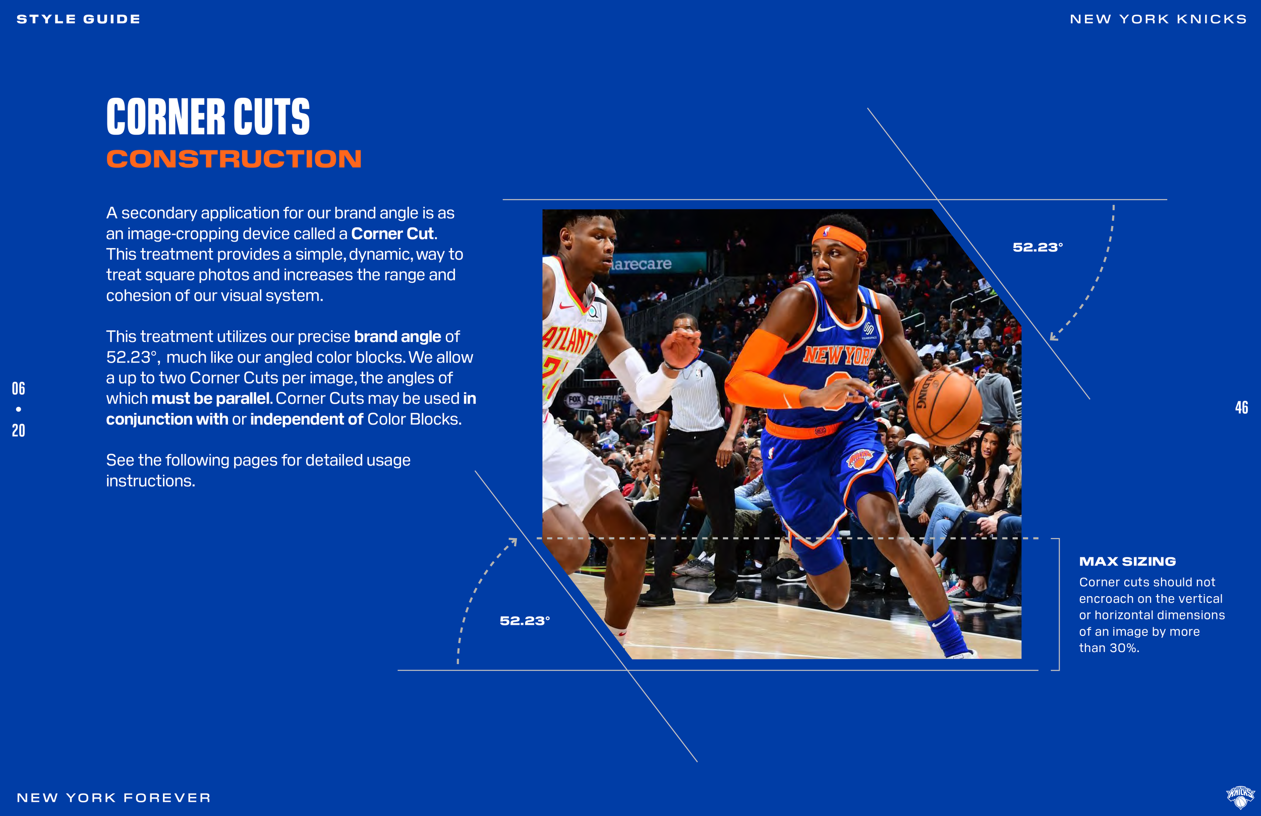
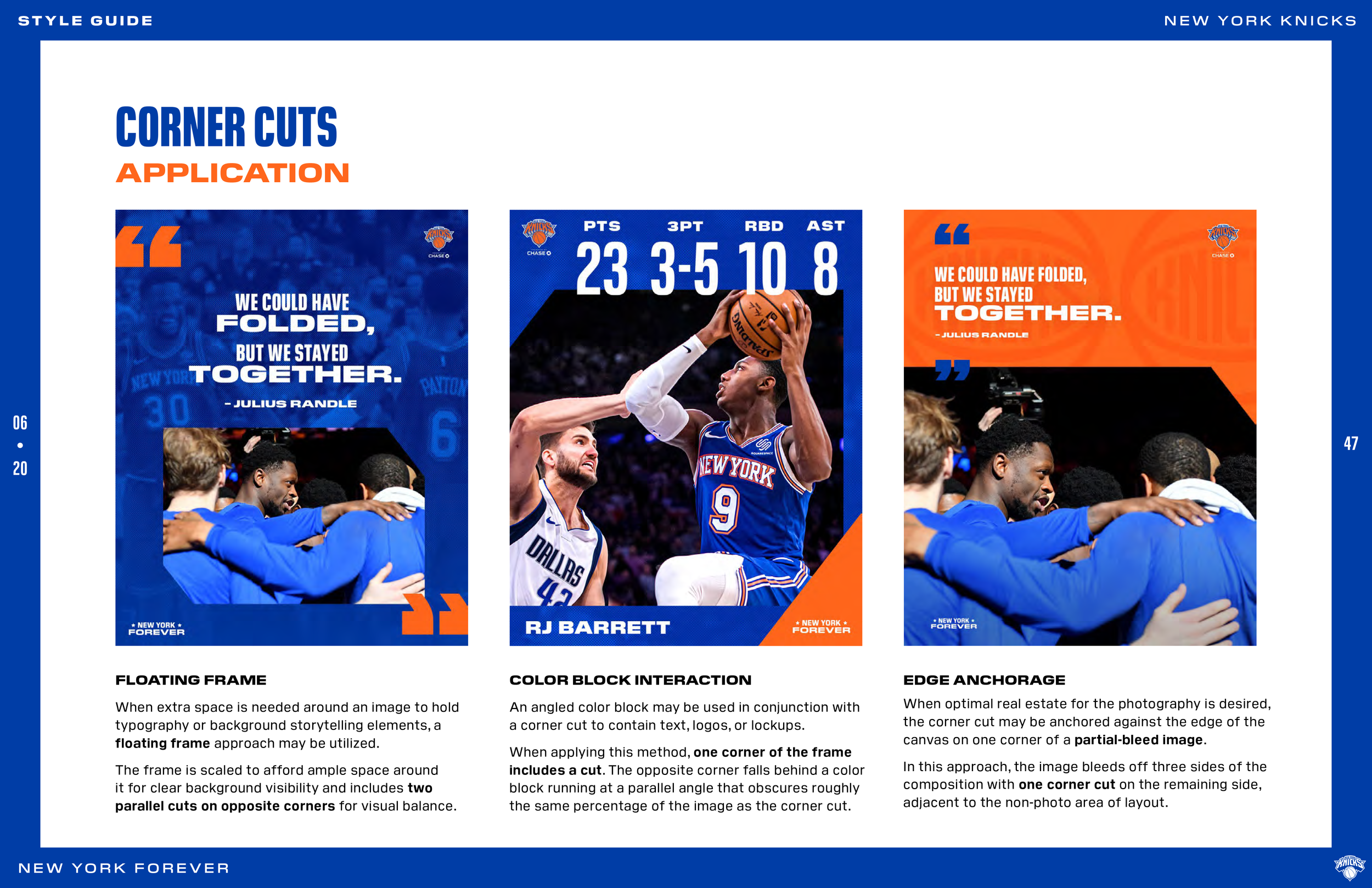
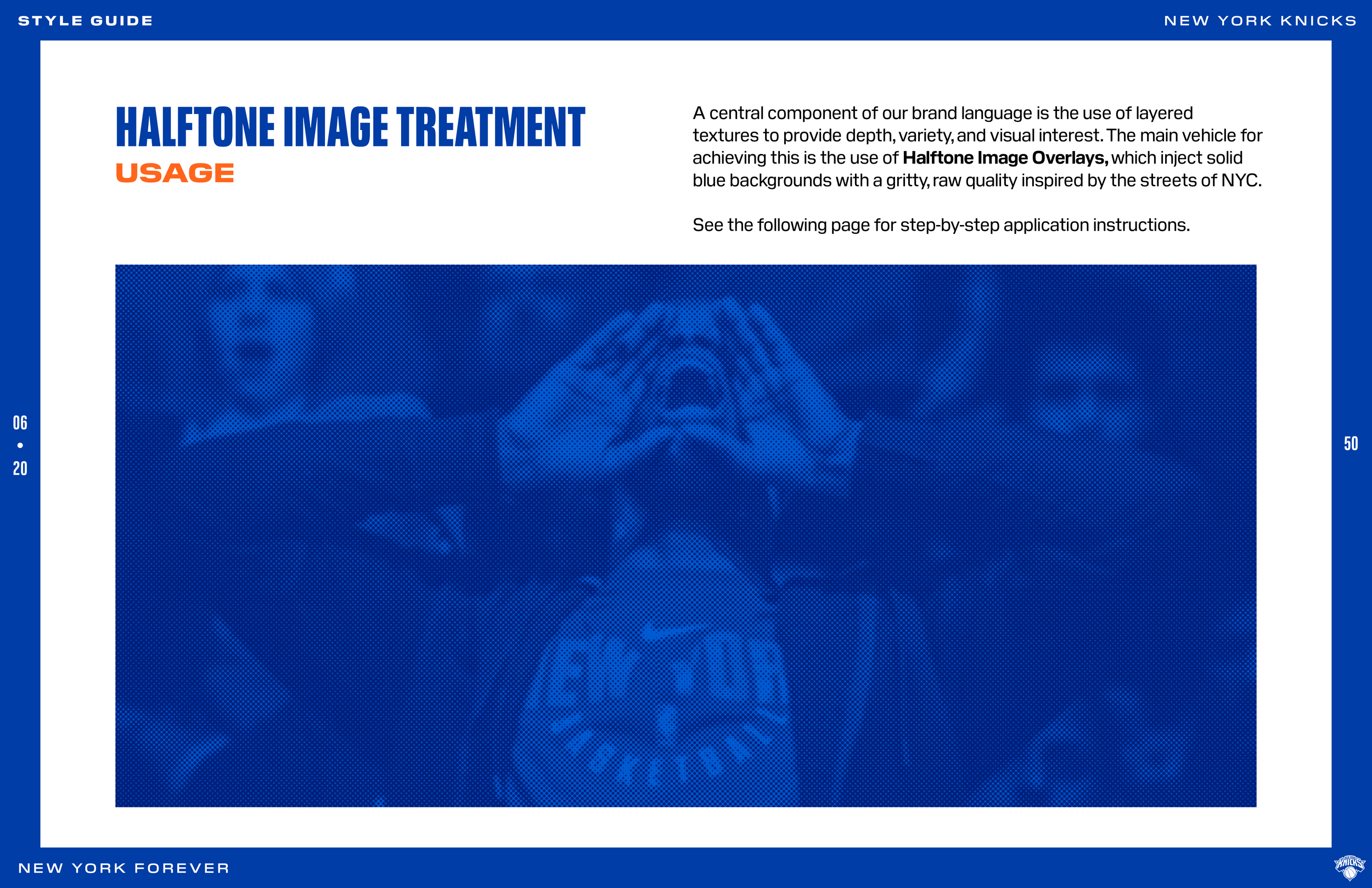
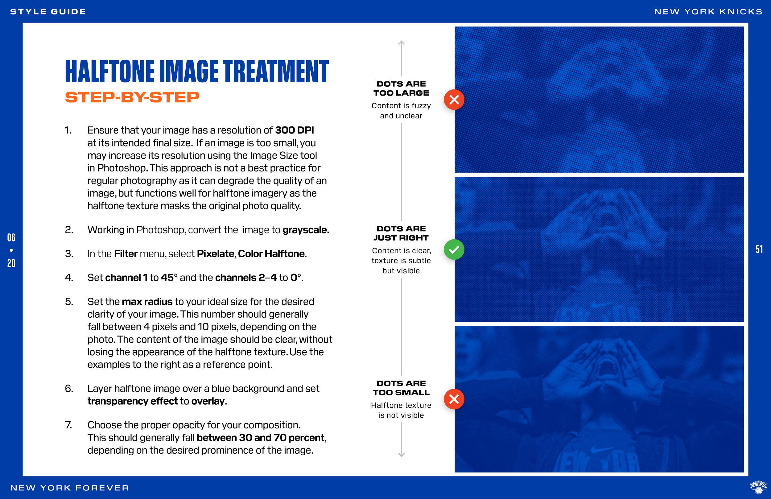
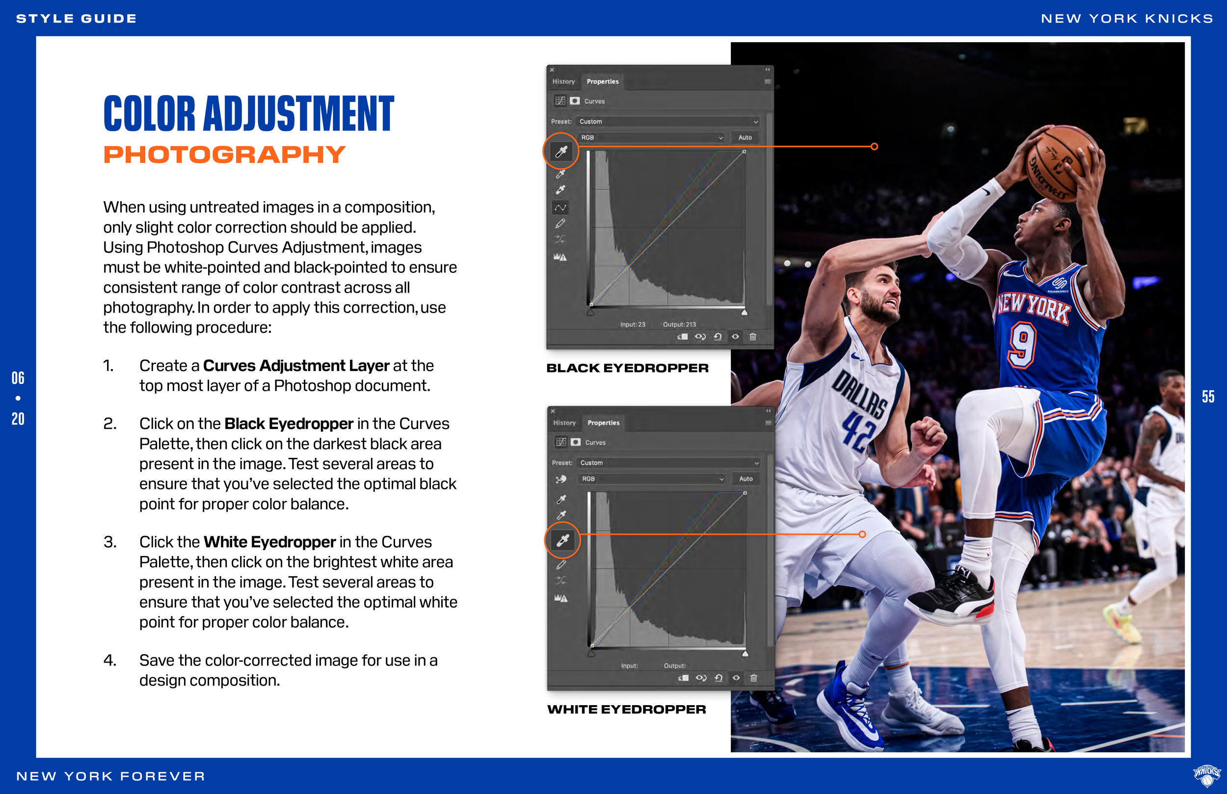
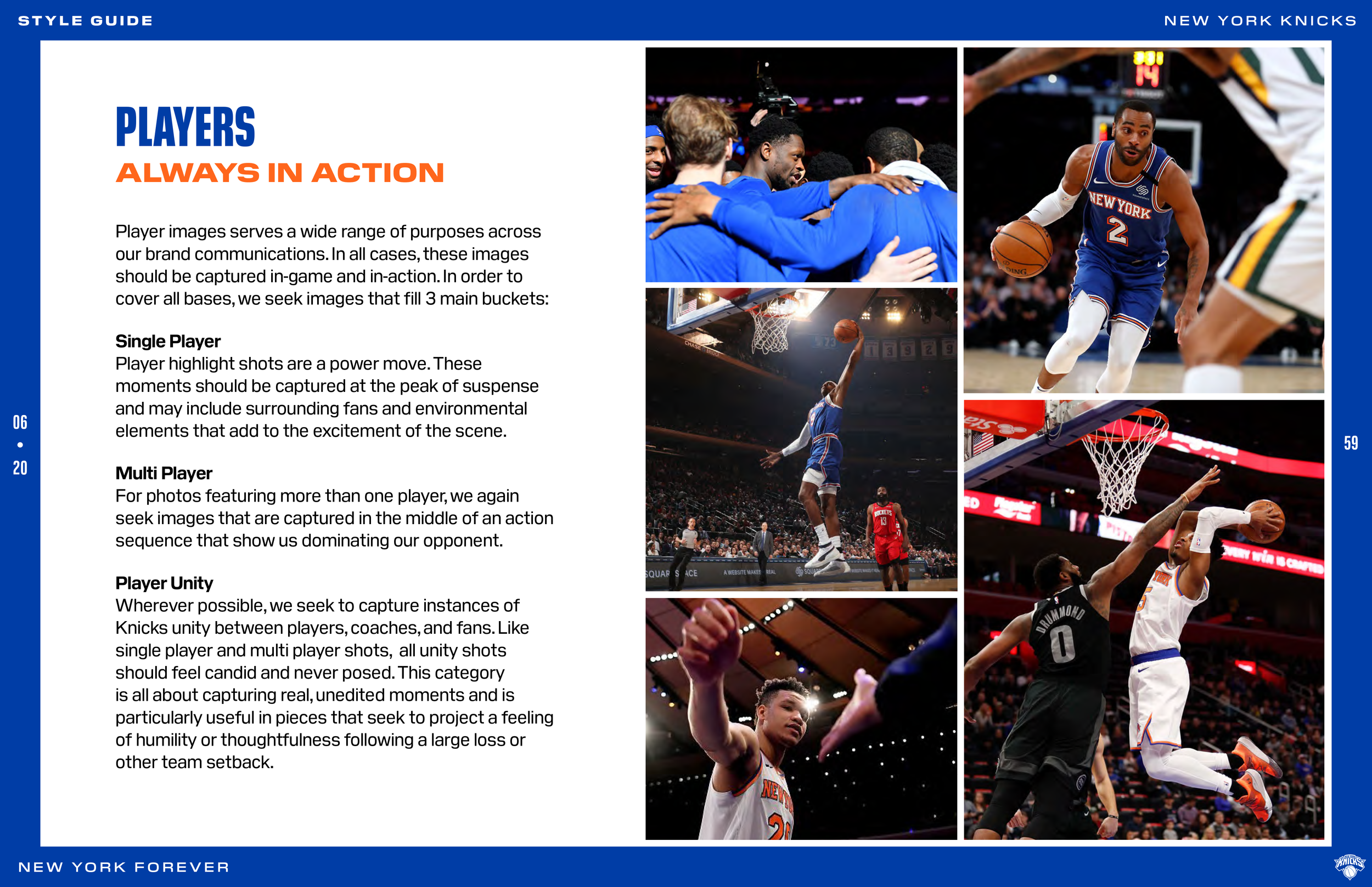
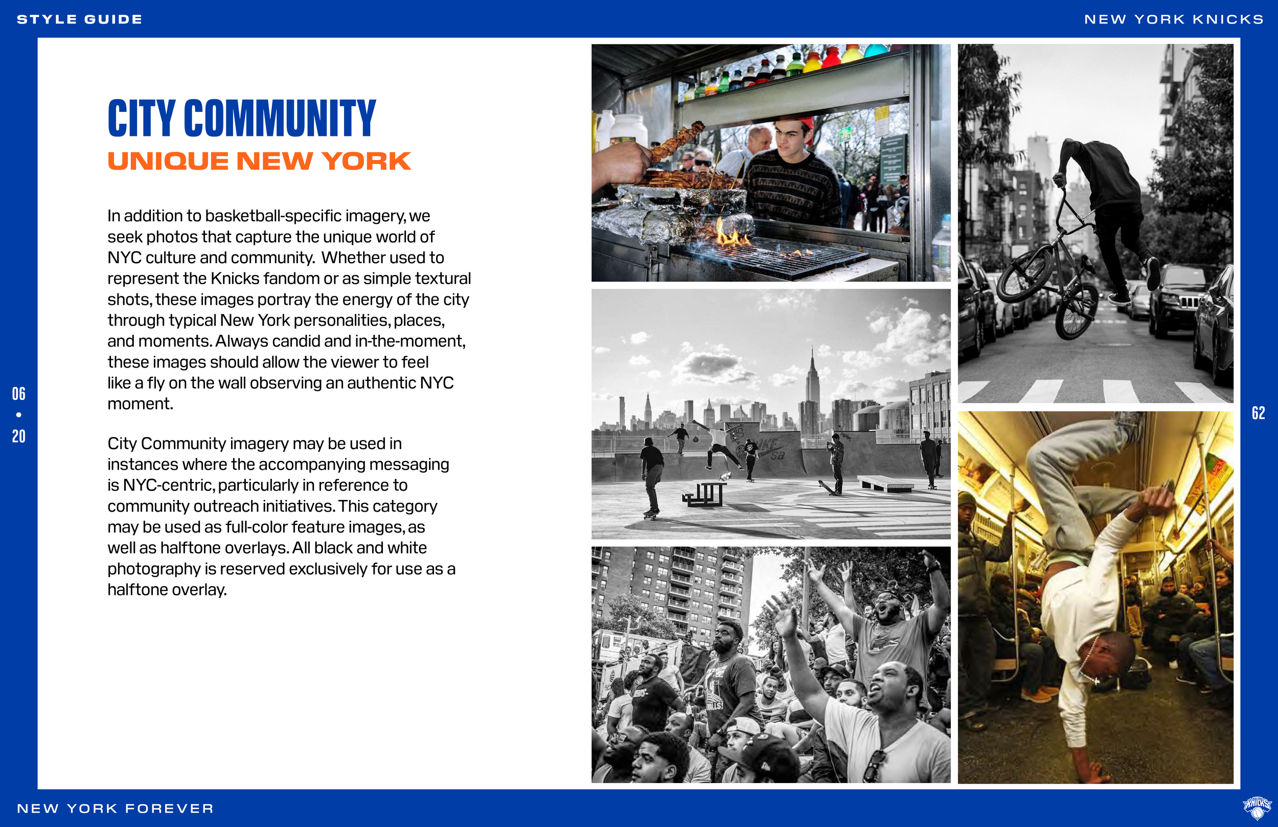
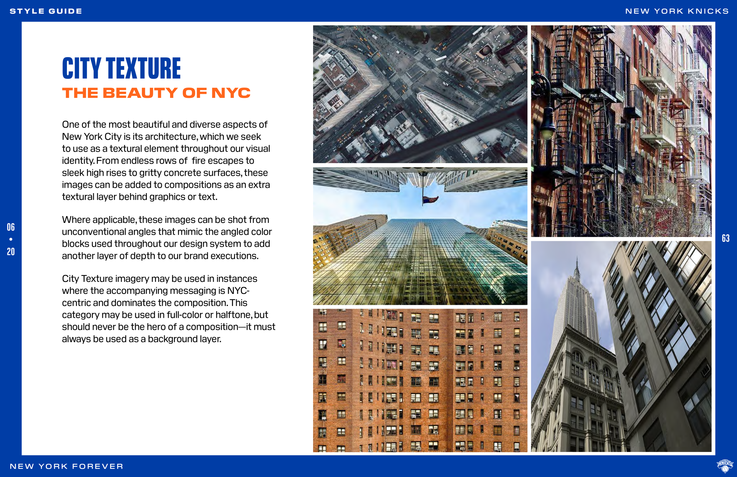
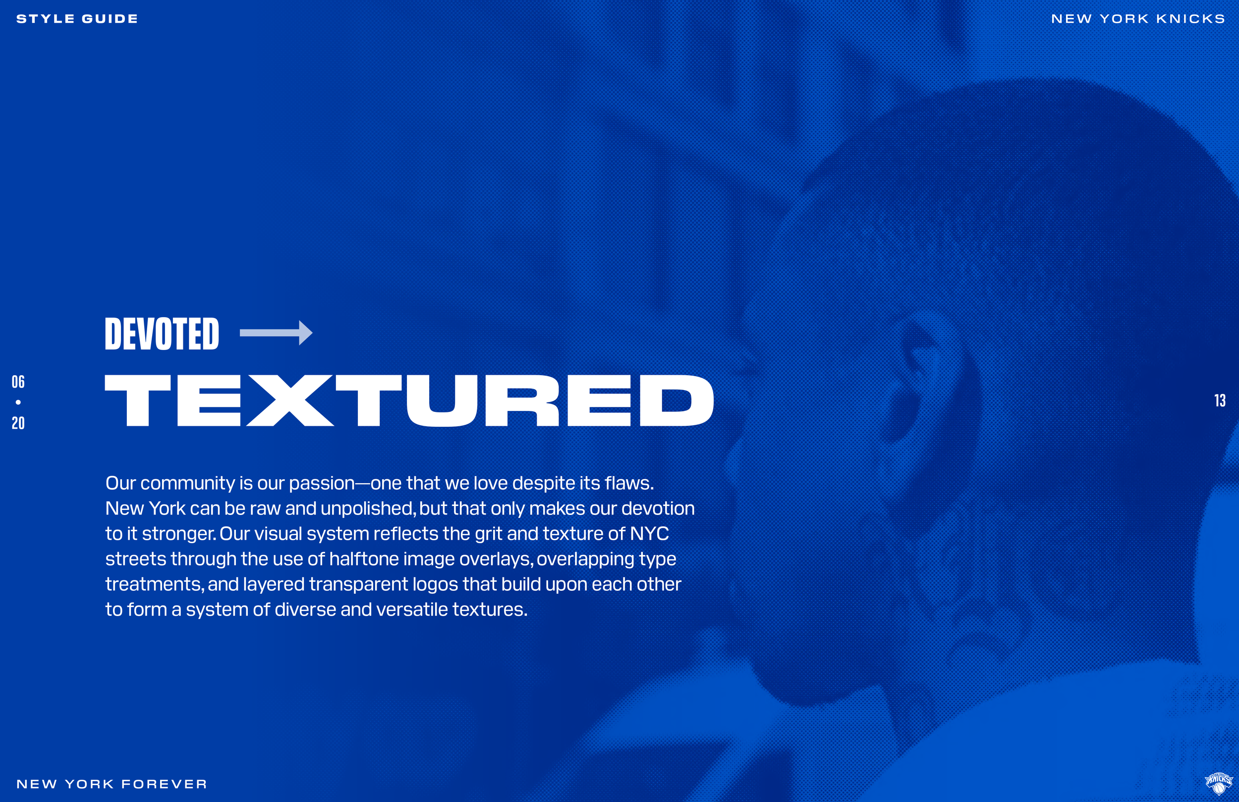
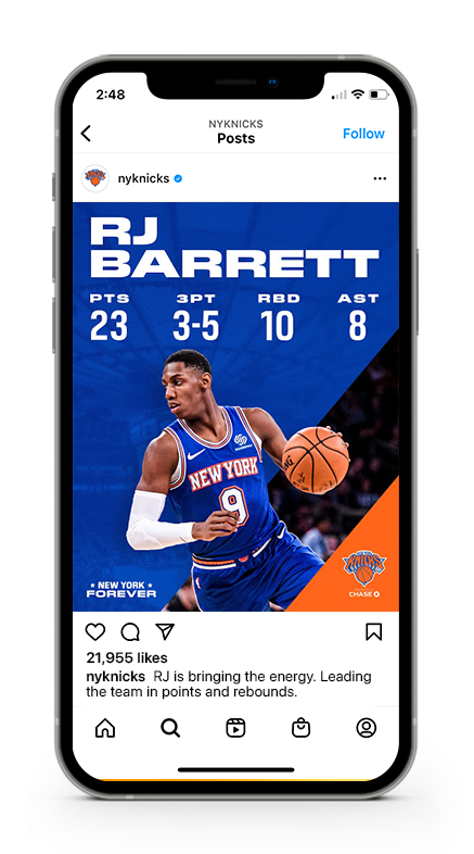
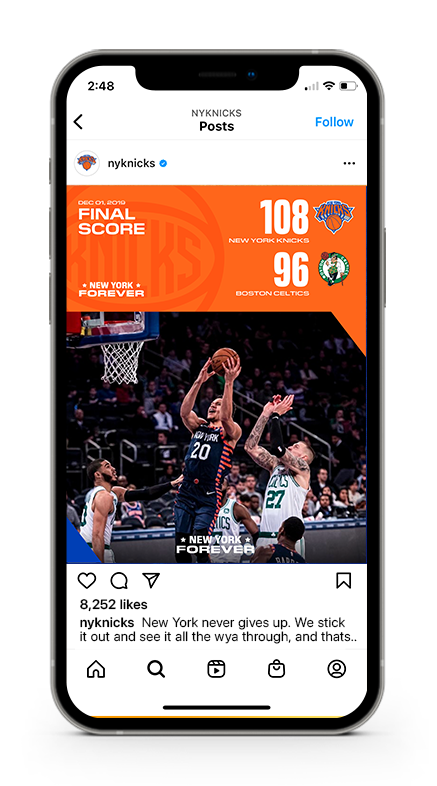
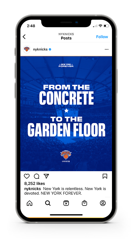
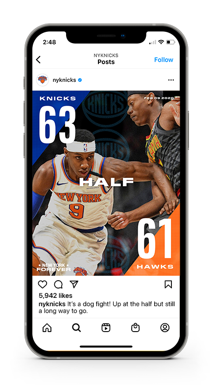
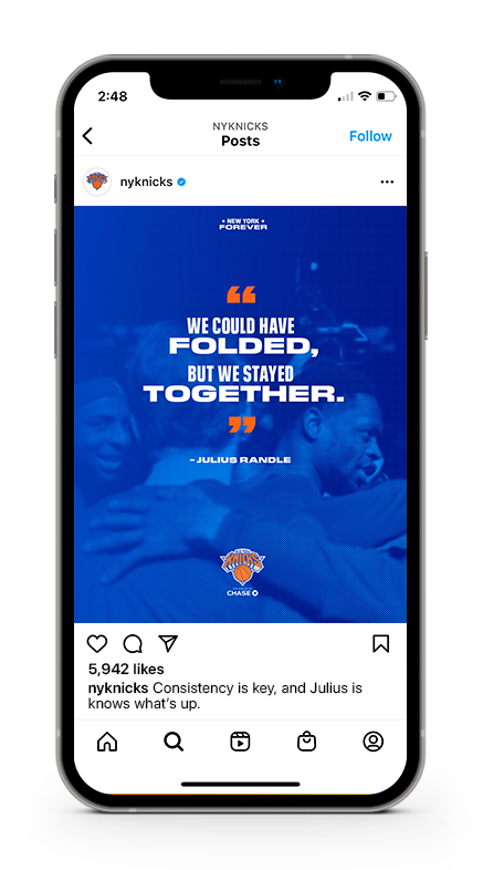
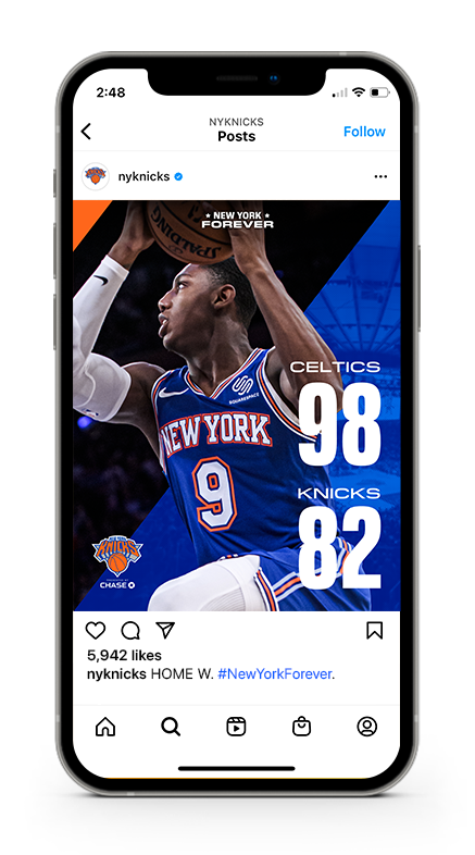
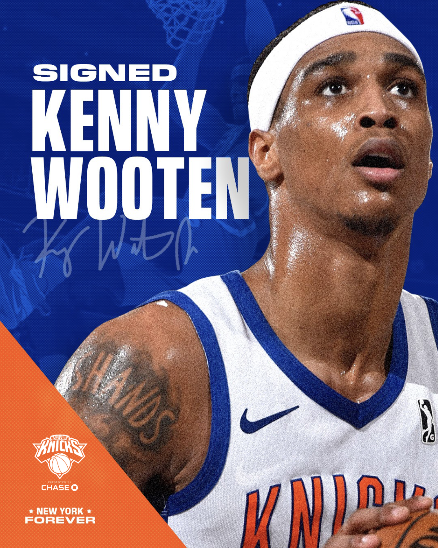
After our audit and chosen direction we fleshed out our designs and graphic language. In designing against social and OOH we created rules around typography, hierarchy, the use of the angles that are based on the core Knicks logo, use of textured photography and highlighting players, as well as a thought-out use of the secondary logo as supporting texture.


Brand Guidelines
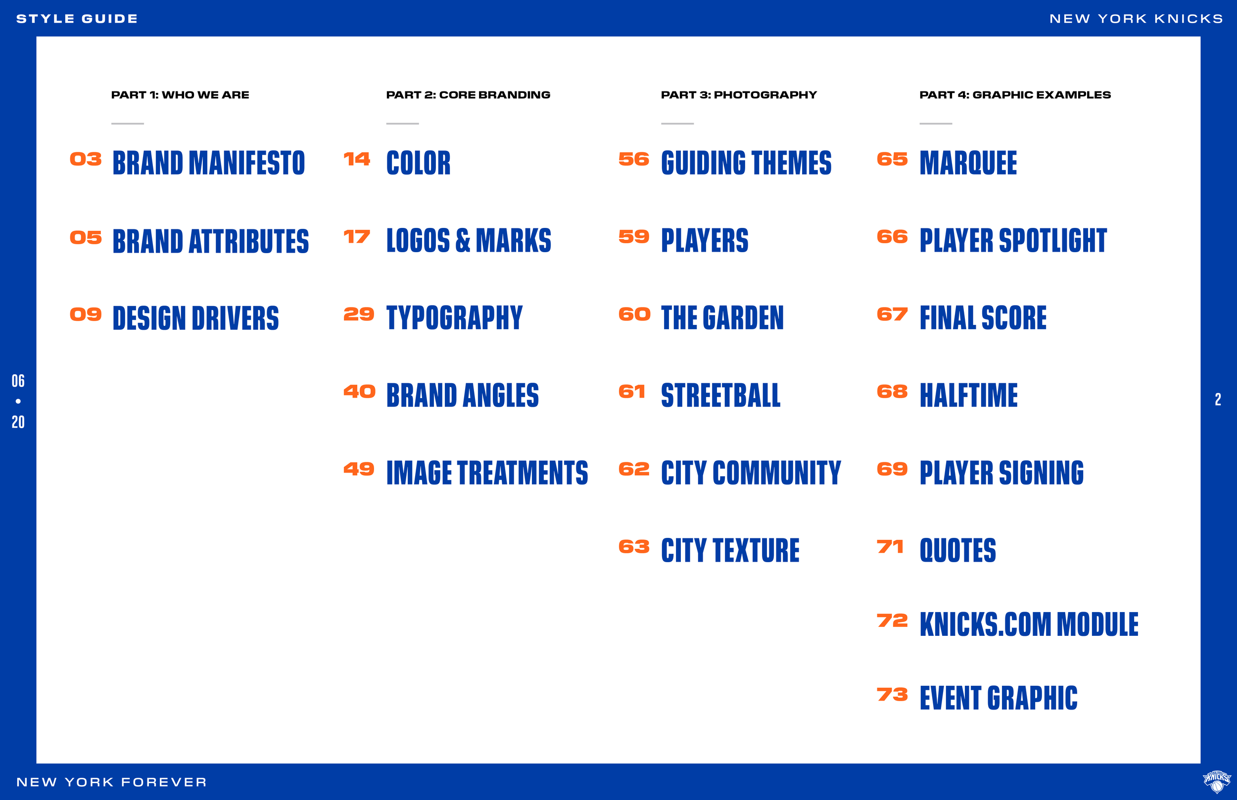
This 74 page brand book was the result of 5 months of labor from audit to execution. This document covered the Knicks tone of voice, logo and secondary marks, color hierarchy, how brand angles were to be applied, treatment of images, guiding themes, and examples of how it all came together. Below are just a few pages pulled out from our labor of love.